Website color palettes
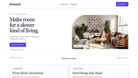
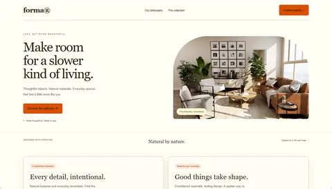
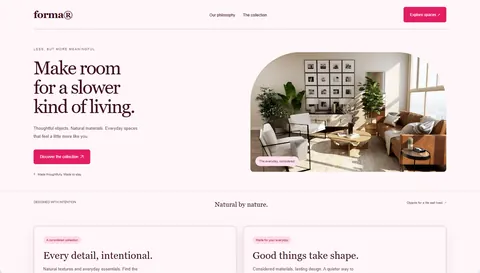
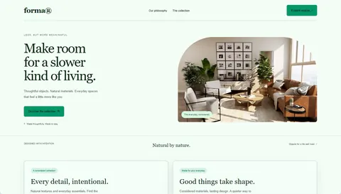
48 palettes made for real websites: each one sets the background, surfaces, text, accent and muted text, and comes with readable contrast. Pick one to see it on an example site, or try it on your own.
Earthy color palettes for websites
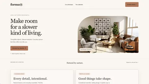
Muted greens, clay and sand on warm off-white. Earthy palettes feel calm and natural, and suit brands that want to look grounded rather than loud: interiors, food, wellness, outdoor gear and slow-living shops.
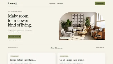
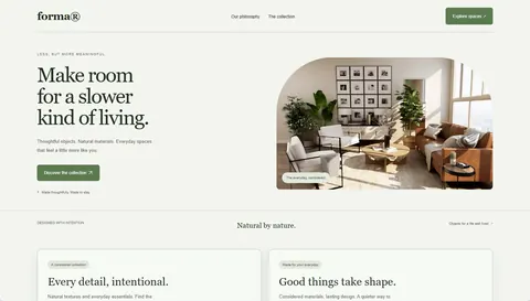
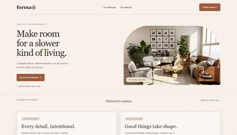
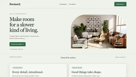
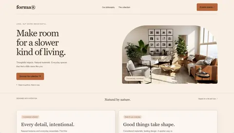
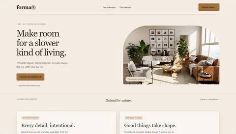
Warm color palettes for websites
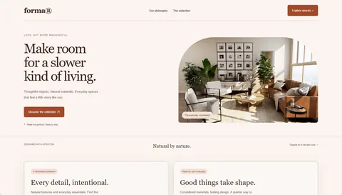
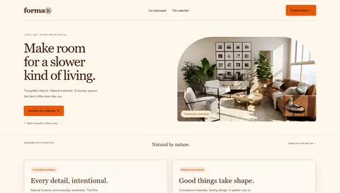
Terracotta, saffron and rose on cream. Warm palettes feel friendly and personal, and work well for hospitality, coaching, creative studios and consumer products that want to feel human.
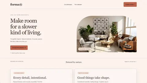
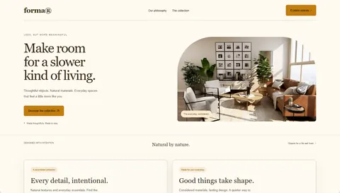
Cool color palettes for websites
Blues and teals on crisp light grounds. Cool palettes read as trustworthy and precise, which is why SaaS, fintech, developer tools and B2B services use them so often.
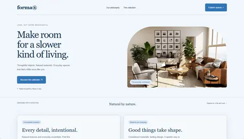
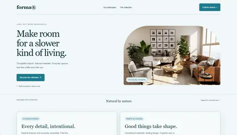
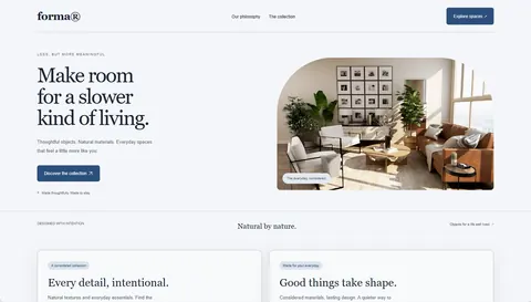
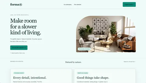
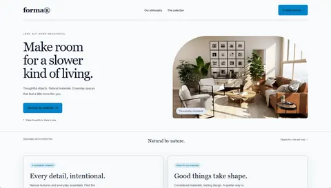
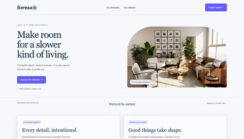
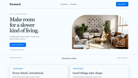
Pastel color palettes for websites
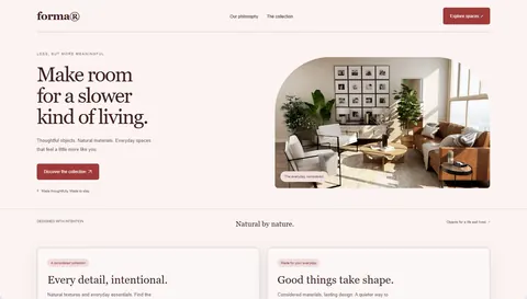
Soft pinks, lavender, mint and peach with deep text for contrast. Pastel palettes feel gentle and approachable: good for beauty, kids, events, wellness apps and playful products.
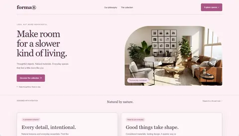
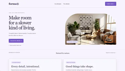
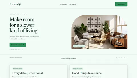
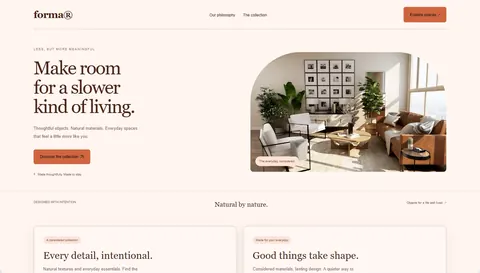
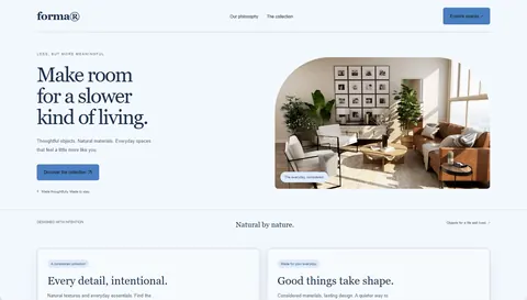
Vibrant color palettes for websites
One saturated accent on a clean ground. Vibrant palettes make calls to action stand out and suit launches, marketplaces, e-commerce and products that want energy.
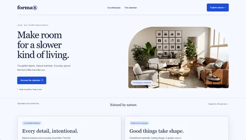
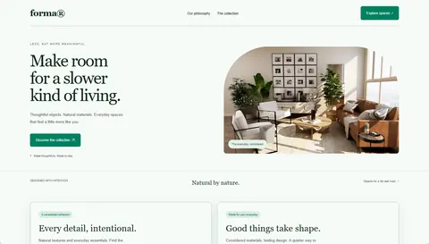
Minimal color palettes for websites
Near-monochrome grounds with a single quiet or sharp accent. Minimal palettes let content and photography lead: portfolios, agencies, editorial sites, architecture and design studios.
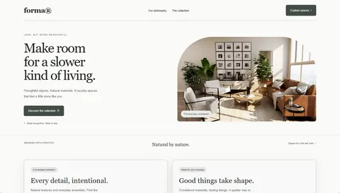 Ink & paperWriters, newsletters, editorial
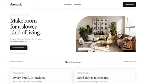 Gallery whitePortfolios, photographers, agencies
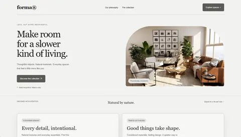 ConcreteArchitecture, industrial design, studios
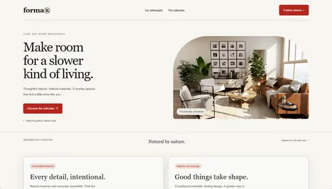 NewsprintNews, magazines, opinion blogs
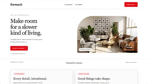 SwissDesign studios, typography-led brands
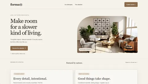 OatmealLifestyle, coffee, natural products
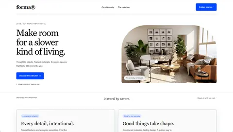 High contrastAccessibility-first sites, public services
Dark color palettes for websites
Deep backgrounds with light text and a bright accent. Dark palettes feel focused and premium and suit developer tools, music, gaming, nightlife and products with a dark mode.
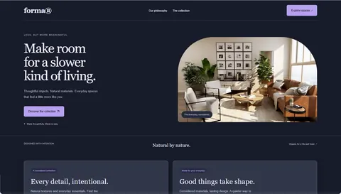 After hoursMusic, events, creative apps
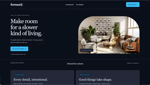 Midnight neonDeveloper tools, AI, tech launches
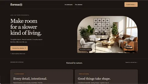 EspressoCoffee, cocktails, premium food
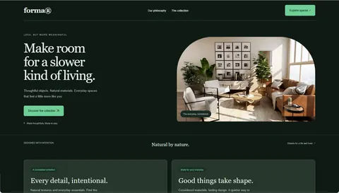 Deep forestOutdoor, sustainability, wellness at night
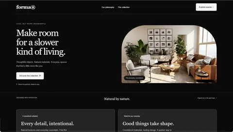 ObsidianPremium tech, portfolios, product launches
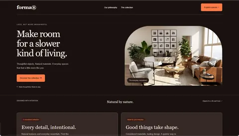 EmberGaming, fitness, bold campaigns
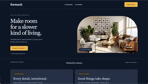 Navy & goldFinance, law, luxury services
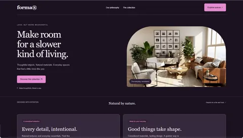 Plum nightBeauty, nightlife, creative communities
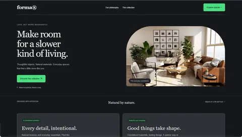 GraphiteDeveloper tools, terminals, dashboards
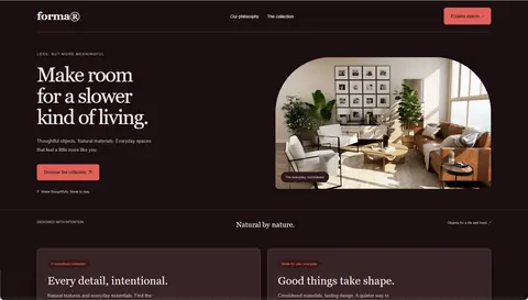 OxbloodWine, fashion, editorial at night
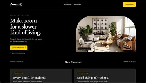 BlackoutStreetwear, events, high-impact launches