High contrast color palette
Pure black and white with a strong blue accent. The highest readability of all the palettes.
Best for: Accessibility-first sites, public services
- Background
#ffffff - Surface
#eeeeee - Text
#000000 - Accent
#0047ff - Muted text
#4a4a4a
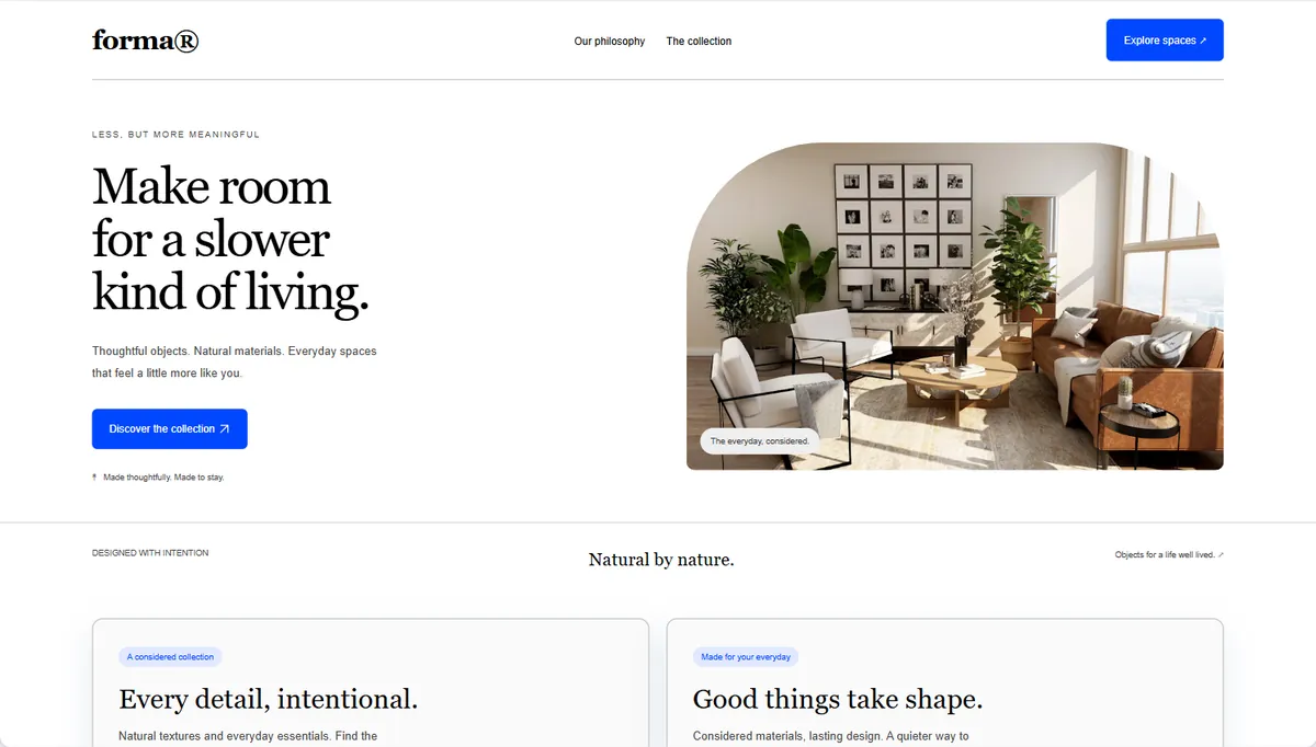
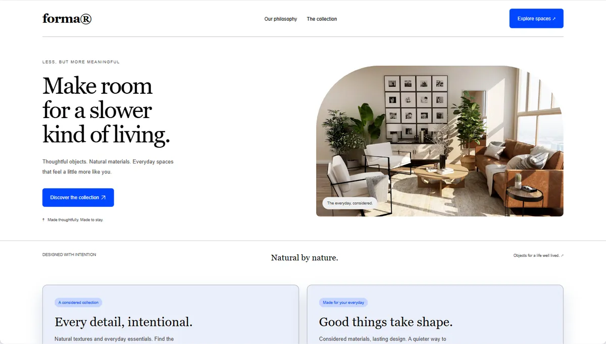
High contrast on a real website
Colorit's example site restyled with this palette. Balanced keeps surfaces close to the background; Expressive tints cards and sections with the accent. Your own site looks different: capture it to see.
Readable by design
Colorit turns the five colors into a full theme and checks each text pair. Ratios of 4.5:1 and above meet WCAG AA for body text.
| Pair | Contrast |
|---|---|
| Text on background | 21.0:1 |
| Muted text on background | 8.9:1 |
| Button text on accent | 6.3:1 |
| Text on cards | 20.1:1 |
Use the High contrast palette in code
The five colors as CSS variables and as a Tailwind v4 theme. For the full semantic theme (surfaces, borders, button states) as shadcn/ui, Tailwind or CSS, open it in the free theme generator. A prompt for your coding tool, made for your own captured site, comes with Colorit Pro.
:root {
  --color-1: #ffffff;
  --color-2: #eeeeee;
  --color-3: #000000;
  --color-4: #0047ff;
  --color-5: #4a4a4a;
}
@theme {
  --color-1: #ffffff;
  --color-2: #eeeeee;
  --color-3: #000000;
  --color-4: #0047ff;
  --color-5: #4a4a4a;
}